
Route Map: Adding and customising the Section
What is a Route Map?
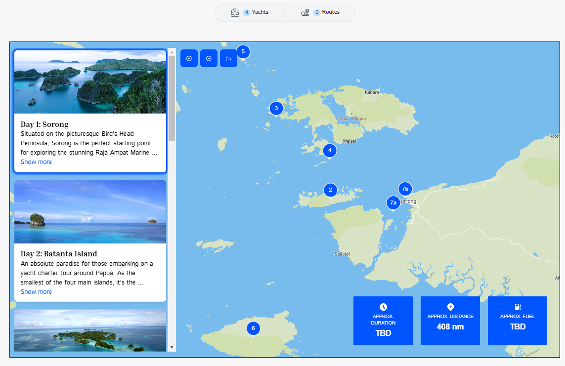
Ankor's Route Map section provides an overview of the route you have selected to include in your presentation. Include calculations on estimated distance, duration, and fuel consumption.
▶️ Checkout this awesome example presentation. of our map section in one of our presentations
Add the Map to your Presentation
To add the Map to your presentation:
1. Click the "+ Add Section" to open the section selection menu.

2. Find the section called "Route Map" and click 'Add' to drop it into your presentation.

The section should look something like this:
Customise your Map
Ankor's Route Map is not only easy to use but also offers customizable options, allowing you to choose between viewing day cards, distance, time, or fuel consumption based on your needs. Once you have added it, you can begin customising the information.
1. By simply hovering in the Route Map that you have added in your routes. you can modify it through the pencil button in the top right part of the section.

From there. you can change the style
2. Next, go to the 'Settings' tab to modify the map bring displayed. Hide or show specific elements using the toggles or give the map some data to show by adding the cruising speed, fuel consumption and distance travelled.

⚡Quick Tip
You can preview the presentation before sharing it; simply click the 'Preview' button at the top of the screen.

Still Need Help?
Speak to our Customer Success team, who are here to support you via support@ankor.io or chat with us using the Life ring Help feature at the bottom right of our application.